the gym group
Redesign of the gym page
CLIENT: the gym group | WORK: Website Redesign | DISCIPLINES: UX/UI DESIGN
THE VISION
The gym page (product page) is the highest conversion page within the gym group’s website. Although it has the highest conversion, it has never performed to its maximum potential, for various reasons, missing crucial information, incorrect hierarchy, length of page and poor engaging content.
After running some initial user testing sessions, we found most users skipped our homepage, mainly because they used google search to find a gym near them, and the search results and SEO pushed users directly to our gym page. For this reason the gym page had to work extremely hard to engage and convert visitors.
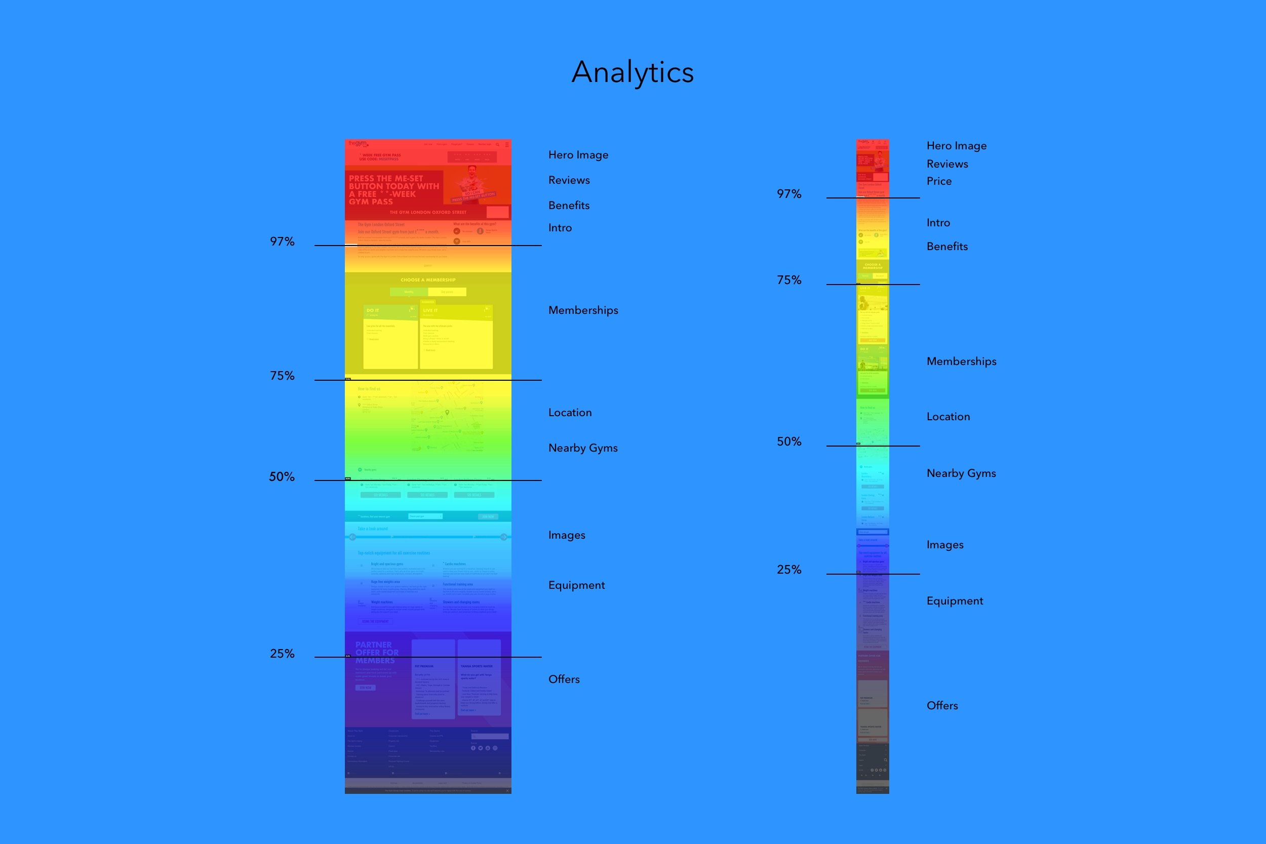
Based on the analytics from GA and Hotjar, we knew where users came from, how long they would stay on the page, the bounce rate, conversion rate, focus areas and scroll reach. We knew the numbers, but not the reasons why.
We were in a mission of discovery to deliver to users expectations, which would therefore increase content engagement and conversion rates.
MY ROLE
My role as a UX/UI Lead was always to be an enabler and provide support and direction to my team. I did that by working closely with Product Owner, BA, Tech Designer, Developers and QAs to understand requirements, strategise a project plan and run the right design process to achieve our desired goals.
I would then give the design direction and ux approach to my team, who would follow an agile methodology, one sprint ahead of the development team, this allowed us time to complete all stages of our work and be ready for handover.
THE APPROACH
I co-ordinated my design team to deliver on the task at hand, by adopting the design thinking process.
It was important to me that the whole team was aware of the process and our UX principles which I had set when I joined the gym group. This made it easier to get everyone onboard and focused in the same goal.
I ran competitor analysis by benchmarking our current gym page against our main competitors - low budget gyms - to give us a baseline, from there we moved to a workshop where we played back some initial user testing results and analytics with stakeholders, marketing, trading teams and well as product team members and development team. This ensured we had a voice from different parts of the business.
The workshop had great participation which meant a greater understanding of the task, requirements and problem statements. We then moved into user flows and wireframes as we needed to know the full journey would work smoothly. Once we felt we were at a good place, we ran some more user testing sessions to validate our assumptions.
Our user testing sessions were crucial to our process, we found out the most important pieces of information users would be looking for on the page, and what content they would need to see to make a decision to join the gym.
After a few iterations, we got to a place where we could not only seek sign off of the work from stakeholders, we could also start documenting all new components (on confluence) and specifications in detail (on zeplin) ready for the development team.
THE SOLUTION
It was clear that our gym page was lacking information, specially above the fold when comparing to our competitors. We didn’t make great use of our real estate and what would entice users to scroll.
The only information we had above the fold was:
• Hero image with offer • Gym name • Reviews • Price
And when we had our initial feedback from our users, it was clear that we had a lot of problems, as follow:
• Generic hero image • Location information buried at the bottom • Too many colours • Large fonts • Price not clear
Users found the page was too busy, shouting information at them and the really useful information was either not available or very low on the page, where only 50% of users would actually reach.
We had business requirements as well as users ones. Once listed them out, we organised then from hierarchy point of view, what information the user would want to know first and what would come down the page.
We’ve mocked up a few versions of the gym page where we took them again to re-test and compare them to our competitors. After a few iterations, our page had the following content hierarchy:
• Gym name • Rating • Opening hours • Location/Address • Price • Brief intro • Memberships • Gallery • Map & Directions • Facilities • Classes • Testimonials
When tested, our gym page was voted as cleaner, clearer and more engaging, out of all our competitors.
The page was successfully launched with the website redesign work in April 2022. The page not only brought improvements to our users, it also help our content managers to update content, add or remove components very easily and quickly.
Since its launch, we kept an eye on analytics and have made some changes to hierarchy and membership component which increased conversion rate.